WatchOS 27's Dynamic App Grid Makes Apple Watch Home Screen Less Cluttered
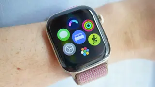
WatchOS 27 introduces a dynamic app grid that shows six frequently used or recent apps when the Digital Crown is pressed, with the full app list available through an additional bubble. The author says this reduces clutter and makes common apps easier to reach, and hopes similar options come to other smartwatches.
WatchOS 27’s revised app layout prioritizes six apps that are either used often or opened recently. Pressing the Digital Crown reveals these choices, while a bubble at the bottom leads to the complete app collection. The writer notes that only a small fraction of roughly 40 installed apps get daily use, citing Fitness, Timer, Messages, Activity, Heart Rate, and Sleep as personal examples.
The update also preserves a choice between list and grid views, accessible by swiping to the bottom of the display. It runs on Apple Watch Series 9 through 12, SE 3, and Ultra 2 through 4, provided the paired iPhone is updated to iOS 27. Other additions include a more conversational Siri AI with its own app and a widget for opening the Smart Stack.
This change may affect smartwatch users who struggle with small touch targets or crowded screens, especially those with larger fingers or limited dexterity. By surfacing frequent apps, it could reduce friction and make wearables more accessible for quick tasks. If rivals adopt similar layouts, the broader smartwatch market may shift toward prioritizing relevance over exhaustive app displays. However, impact depends on adoption and whether users value faster access over seeing all apps at once.